DTF printing changed everything for custom apparel. I’m not exaggerating. Before DTF came along, printing on dark garments was a whole production. You needed pretreatment. Special equipment. A lot of patience.
Now? You print on a film, apply powder, cure it, and press it onto basically any fabric color you want.
But here’s what people don’t always realize. The color of your garment still matters. A lot. What works on a white tee doesn’t automatically work on black. The process looks similar on paper, but the details? Completely different.
That’s what we’re covering here. How DTF behaves on light garments versus dark ones. The ink requirements. The costs. The design tweaks you need to make. And the mistakes I see people making over and over.
By the end, you’ll know exactly how to approach both. Whether you’re just starting out or you’ve been printing for years and want to tighten up your process, this is the stuff that actually matters.
For what it’s worth, xcinkjet.net offers DTF solutions built to handle both dark and light garment printing. I’ll mention where that’s relevant as we go.
How DTF Printing Works
Before we compare dark and light, let’s make sure we’re on the same page about the actual process.
DTF stands for Direct to Film. That’s the core of it. You’re not printing directly onto fabric. You’re printing onto a clear PET film first.
Here’s how it breaks down:
- You create your design. Whatever software you use. Photoshop, Illustrator, doesn’t matter. Just make sure your resolution is solid.
- The design gets printed onto PET film using special DTF inks. We’re talking CMYK plus white ink. That white layer is critical—we’ll get into why.
- Right after printing, you apply hot melt powder. This adhesive powder sticks to the wet ink.
- The powder gets melted and cured. Usually in an oven or with a heat source built into the printer setup.
- You take that cured transfer and press it onto your garment with a heat press. The design bonds to the fabric.
Done.
The cool thing is this process works on both dark and light garments. Same basic steps. But here’s where people trip up—the settings, the ink layers, the design prep? That changes depending on garment color.
Same machine. Same ink. Different approach.
Understanding Garment Color in DTF Printing
This might sound obvious, but it’s worth saying out loud. Fabric color affects everything about your print.
Think about it. Ink isn’t truly opaque. Even DTF ink. When you print on a white shirt, the white fabric itself reflects light through your colors. That’s why prints on light garments look so vibrant. The fabric does some of the heavy lifting.
Dark garments? The fabric absorbs light. If you printed CMYK directly onto black cotton without a white underbase, your colors would just… disappear. You’d barely see anything.
This is actually where DTF shines compared to methods like DTG. With DTG on dark garments, you need pretreatment, you need multiple passes, and honestly the results still aren’t as consistent as DTF. Screen printing works, but it’s a whole different animal with screens and setup costs.
DTF handles both. One process. One type of transfer. The white ink layer acts as your canvas on dark fabrics. On light fabrics, you can dial it back or skip it entirely in some cases.
So garment color doesn’t just affect how your design looks. It affects how much ink you use, how long curing takes, what your production costs look like.
Let’s break it down by garment type.
DTF Printing on Light Garments
Light garments are where DTF really shows off. The colors pop. Production is faster. Costs are lower. If you’re just getting started with DTF, white and light gray tees are probably where you’ll see your best results right out of the gate.
But that doesn’t mean there’s nothing to learn here. There are still techniques that separate okay prints from great ones.
Advantages of DTF on Light Fabrics
Here’s why light garments are the easier play:
- Color vibrancy is unreal. The white or light fabric background lets CMYK colors shine. Reds look red. Blues look blue. No muddy undertones.
- What you see is what you get. Color reproduction stays true to your design file. Less guesswork.
- Less ink overall. You’re not laying down heavy white underbases. Just your colored inks. Maybe a light white layer for certain effects, but often not.
- Cheaper per print. Less ink means lower consumable costs. Simple math.
- Faster production. Less ink to cure. Quicker pressing times in some cases.
- Pastels and subtle tones work. Light colors on light garments look natural. Try printing a pastel pink on a black shirt—not the same effect.
- Fine details hold up. Thin lines, small text, intricate patterns. They all show clearly without competing against a dark background.
We’re talking white tees, cream colored blanks, light gray, soft pastels. These are your bread and butter for light garment printing.
Best Practices for Light Garment DTF Printing
Alright, some actual technique.
Ink settings matter. Your RIP software should have a profile for light garments. Use it. These profiles adjust how much ink gets laid down. For light fabrics, you typically want standard CMYK saturation without overdoing it.
White ink underbase—sometimes yes, sometimes no. This confuses people. On a pure white shirt, you often don’t need white ink at all. The fabric is your white. But if you’re printing on cream, light yellow, or any off-white color, a thin white layer helps keep colors true. Also, any design elements that are supposed to be white? Yeah, you need white ink for those.
Powder application stays consistent. Don’t overthink this part. Apply your hot melt powder evenly. Shake off the excess. Same as dark garments.
Heat press settings for light garments. Generally around 300-320°F (150-160°C) for 10-15 seconds. But check your specific powder and ink specs. Every setup is a little different.
Color management. Calibrate your monitor. Use proper color profiles. Light garments show color inaccuracies more obviously because there’s nowhere to hide.
Xcinkjet.net’s DTF inks are optimized for this stuff, by the way. Good color gamut, consistent flow. Makes a difference when you’re trying to match Pantone colors for a client.
Common Challenges and Solutions
Light garments aren’t problem-free. Here’s what comes up:
Show-through on thin fabrics. If you’re printing on a really lightweight tee, ink can seep through and create shadows on the inside or even the back. Solution? Use lighter ink loads. Test your specific blanks before committing to a big run.
Color matching headaches. Screen looks different from print. Print looks different on different fabric shades. Solution? Print test swatches. Adjust your files. Accept that some variation is normal.
Over-saturation. Too much ink creates a stiff, heavy feel and can cause cracking. Solution? Back off your ink limits in RIP settings. More isn’t always better.
Texture issues. Some people complain about a plasticky feel on light garments. Solution? Make sure you’re pressing with correct temperature and time. Under-cured transfers feel worse. Also, quality inks and powder matter here.
DTF Printing on Dark Garments
Now we’re in different territory.
Dark garment printing is more technical. More things can go wrong. But when you get it right, the results are honestly impressive. Vibrant graphics on black fabric that don’t crack after washing? That’s the goal.
Here’s the deal though—you need to understand white ink. Really understand it.
Advantages of DTF on Dark Fabrics
Why bother with dark garments when light is easier? Because the market demands it. Black tees sell. Navy polos sell. Dark hoodies are everywhere.
And DTF makes it possible without the pain of other methods.
- No pretreatment. DTG on dark garments requires spraying pretreatment solution and often heat pressing before you even print. DTF? Skip all that.
- Vibrant colors are possible. With a proper white underbase, your CMYK colors sit on top and look bright. Not washed out.
- Wash durability is excellent. DTF transfers on dark fabrics hold up. I’ve seen prints go through 50+ washes without significant fading or cracking.
- Works on various darks. Black, navy blue, forest green, dark brown, charcoal. All good.
- Better hand feel than screen printing. Thick screen print plastisol on dark shirts feels heavy. DTF transfers, done right, feel lighter.
- Complex designs work. Photographic images, gradients, hundreds of colors. No extra cost per color like screen printing.
Examples: black cotton tees, navy work polos, dark green hoodies, black polyester performance shirts (with some caveats I’ll mention later).
The Critical Role of White Ink Underbase
This is the make-or-break element for dark garment printing.
White ink creates the foundation. Without it, your CMYK colors get absorbed by the dark fabric and disappear. The white layer acts like a white canvas that your colors sit on top of.
Single vs double white layers. Some prints need a single white pass. Others—especially designs with large solid areas—benefit from a double white layer. More white = more opacity. But also more ink cost and potential for cracking if you go overboard.
White ink opacity matters. Not all white inks are equal. Cheap white ink looks grayish or translucent when printed. Good white ink is bright and solid. This is where investing in quality pays off.
How RIP software handles this. Most RIP programs generate the white underbase automatically based on your design. You set parameters—choke (shrinking the white slightly so it doesn’t show around edges), opacity percentage, single or double pass. Learn your RIP software. Seriously. This is where half the magic happens.
Xcinkjet.net’s DTF printers handle white ink channels well. Consistent output, good recirculation to prevent settling. White ink is dense—it wants to settle in the lines and clog things up. Proper maintenance and good equipment design matter.
Troubleshooting white ink problems:
- Clogging: Print regular test patterns. Do head cleanings. Don’t let the printer sit idle for days without use.
- Uneven coverage: Check your print heads. Could be partial clogs or a failing head. Also check RIP settings—maybe white layer percentage is too low.
- Grayish white: Ink quality issue. Or your white ink has been sitting too long and pigment has settled. Shake the bottle before refilling.
Best Practices for Dark Garment DTF Printing
White ink layer settings. Start with your RIP’s default for dark garments. Then adjust. I typically run 80-100% white depending on the design. Full coverage prints need more. Text and linework can get away with less.
CMYK goes on top. Print order is usually white first, then CMYK on top. Your RIP handles this. Just make sure it’s configured correctly.
Ink saturation adjustments. You might need slightly higher CMYK saturation on dark garment profiles since colors are sitting on white ink, not directly on white fabric. Test this.
Powder application needs to cover more ink. With heavier ink loads, make sure powder coverage is thorough. Any spot without powder won’t transfer properly.
Extended curing. More ink takes longer to cure. If your transfers feel tacky or don’t adhere well, cure time is usually the culprit.
Heat press settings. Often similar to light garments—300-320°F range—but you might need slightly longer press times. 15-20 seconds isn’t unusual. Peel hot or cold depending on your film specs.
Test on actual dark fabric. Print a test swatch. Press it on black fabric. Check it. The proof is in the output, not on your screen.
Common Challenges and Solutions
Dark garments give people more trouble. Here’s what I see:
White ink showing around colored edges. This is called gaining. Your white underbase is larger than your colored design, so you see a white border. Solution? Apply choke in your RIP software. Shrink the white layer by 1-3 pixels. Experiment until edges look clean.
Cracking of the white underbase. Too much white ink, pressed at wrong temp, or low-quality ink. Solution? Don’t overdo the white layers. Use quality ink. Test stretch and wash durability before full production.
Colors appearing dull. Could be insufficient white underbase—not opaque enough. Could be ink saturation too low. Could be curing issues affecting color vibrancy. Solution? Troubleshoot each variable. Increase white opacity. Boost saturation slightly. Verify curing temps.
Adhesion problems. Some dark polyester has coatings or finishes that resist transfers. Dark cotton usually works great. Solution? Test your blanks. Consider increasing press time slightly. Some fabrics just don’t play nice.
File preparation mistakes. Forgetting to set up proper white channel in your design software. Or setting white underbase to show on light garment profile. Solution? Double-check your print settings. Light garment mode vs dark garment mode. It matters.
Key Differences: Dark vs Light Garment DTF Printing

Okay. Let’s put this side by side. What’s actually different between the two approaches?
White Ink Usage Comparison
This is the biggest difference. And it hits your costs hard.
Light garments: White ink is optional for many designs. If you’re printing on white fabric, you only need white ink for design elements that are actually white. Logos, text, highlight areas. If your design has no white, you use zero white ink. Cost savings are significant.
Dark garments: White underbase is mandatory for any design where you want colors to show. Even a simple red circle needs white underneath. Full coverage designs use substantial white ink. It’s easily 40-50% or more of your total ink consumption on dark garment prints.
Cost implications: White ink costs money. Prints on dark garments inherently cost more to produce than equivalent prints on light garments. Factor this into pricing.
When white is optional on light garments: Purely colored designs on white fabric. Watercolor effects. Anything where you’re not trying to show white areas.
When white is mandatory on light garments: Any design element that should appear white. Printing on off-white, cream, or colored light fabrics where you want color accuracy.
Color Vibrancy and Accuracy
Colors look different on different backgrounds. That’s just physics.
Light garments: Colors appear more vibrant naturally. The light fabric reflects through semi-transparent ink layers. What you see on screen is close to what you get on fabric.
Dark garments: Colors depend entirely on the white underbase quality. Insufficient white = dull colors. Good white = vibrant colors, but still slightly different than light garment prints. There’s always a subtle difference.
Color shift considerations: Red on white looks different than red on white ink on black. It’s close, but trained eyes notice. Some clients are picky about this.
RGB to CMYK: Always convert to CMYK properly. But understand that CMYK gamut is smaller than RGB. Some bright colors won’t translate perfectly regardless of garment color.
Adjusting designs: For dark garments, I sometimes boost saturation slightly in the design file. For light garments, I might pull back to avoid over-saturation.
Test prints matter. I cannot stress this enough. Print a small test. Check it on actual garment colors. Adjust. Then run production.
Ink Consumption and Cost Differences
Let’s talk numbers. Rough estimates—your specific setup will vary.
Light garment prints: Primarily CMYK. Low to zero white. Total ink consumption is lower. Cost per print is lower.
Dark garment prints: CMYK plus significant white underbase. Total ink consumption is higher—sometimes 30-50% more ink overall. Cost per print is higher.
White ink specifically: Dark garments can use 2-3x or more white ink compared to light garment prints that even use white.
Production cost analysis: If you’re pricing by the print, dark garments need to cost more. Don’t price them the same as light garments. You’ll lose money.
ROI considerations: Dark garments often sell for higher retail prices. People expect to pay more for black tees. So your margins can still work if you price correctly.
Production Time and Workflow
Speed differences exist.
Light garments: Faster printing (less ink). Faster curing (thinner ink layers). Standard QC.
Dark garments: Slower printing (more passes for white). Longer curing times (thicker layers). More QC needed—checking white coverage, looking for edges showing, verifying color opacity.
Production efficiency tips: Batch your work. Run all your dark garment jobs together. Run light garments together. Switching between profiles constantly kills efficiency.
Xcinkjet.net’s DTF systems handle both workflows. Software profiles make switching relatively easy. But you’ll still be faster if you batch similar jobs.
Durability and Wash Fastness
Both hold up well. That’s the good news.
Light garments: Excellent wash durability. Colors may fade very slightly over many washes, but cracking is rare if cured properly.
Dark garments: Also excellent, but the white underbase adds a failure point. If white cracks or peels, it takes the colored design with it. Proper curing and not over-laying white prevents this.
Factors affecting longevity: Ink quality. Curing temperature and time. Powder quality. Press pressure. Fabric quality.
Care instructions: Tell customers to wash inside out, cold water, tumble dry low or hang dry. Same advice for both.
Expected lifespan: 40-50+ washes before noticeable degradation. Good DTF prints last the life of the garment.
Design Considerations for Each Garment Type
Your design choices should shift based on what color you’re printing on. A lot of people skip this part and wonder why their prints look off.
Designing for Light Garments
Light garments are forgiving. You can do more subtle work.
Using lighter colors: Pastels, light pinks, soft yellows, pale blues. These look natural on white fabric. Same colors on black fabric look strange.
Outlines and shadows: Sometimes needed to separate white or light design elements from the light fabric background. A subtle gray shadow makes white text readable on white shirts.
Transparent and watercolor effects: These work great on light garments. The fabric shows through slightly, creating a vintage or artistic look. Doesn’t work on dark garments at all.
Minimalist designs: Simple designs with lots of negative space work well. The fabric is part of the design.
Text readability: Light colored text on light garments needs outlines or shadows. Dark text works without help.
File preparation: Make sure background is transparent where you want fabric to show. Check your white layer settings—usually minimal or none needed.
Designing for Dark Garments
Dark garments need bolder choices.
Bold colors work better. Saturated reds, bright yellows, vivid blues. They pop against dark backgrounds. Subtle colors disappear.
Avoid super light or pastel colors. Pastel pink on black looks washed out even with good white underbase. If you want light colors, make them intentional and graphic, not delicate.
Outlines and borders help. Light colored elements on dark fabric benefit from slightly darker outlines. Creates definition.
Text needs thickness. Thin, delicate fonts disappear. Bold, thick fonts read clearly.
White underbase coverage. Every colored pixel needs white underneath. Make sure your file and RIP settings account for this. Any gaps in white = dark fabric showing through.
Choke and spread techniques. Choke shrinks your white layer so it doesn’t peek out around colored edges. Spread expands it. Usually you want slight choke on dark garments.
File preparation: Set up white underbase in your design software or let RIP generate it. Double check. Output depends on getting this right.
Universal Design Tips for Both
Some things work across the board.
High contrast designs. Strong contrast between design elements always works. Dark darks, light lights. Reads clearly on any garment.
Resolution requirements. 300 DPI minimum. More is fine. Less gets blurry on close inspection.
Vector vs raster. Vectors scale without losing quality. Use vectors for logos and text when possible. Raster is fine for photographic images at proper resolution.
Color profiles. Use CMYK profiles for printing. Don’t work in RGB and assume your printer will convert perfectly.
Technical Specifications Comparison

Getting into the equipment and settings side now.
Equipment Requirements
DTF printer basics: You need a printer with CMYK channels plus dedicated white ink channel(s). Some printers have single white, some have dual white channels. Dual white prints faster and allows for heavier coverage.
White ink channel matters most. This is your limiting factor on dark garments. Better white channel = better dark garment output.
RIP software settings: Light vs dark modes. White underbase generation. Choke settings. Ink limits. Learn your RIP. It’s where you control everything.
Heat press: Quality heat press with even pressure. 15×15″ is minimum for most garments. Clamshell or swing-away—both work. Consistent temperature across platen is non-negotiable.
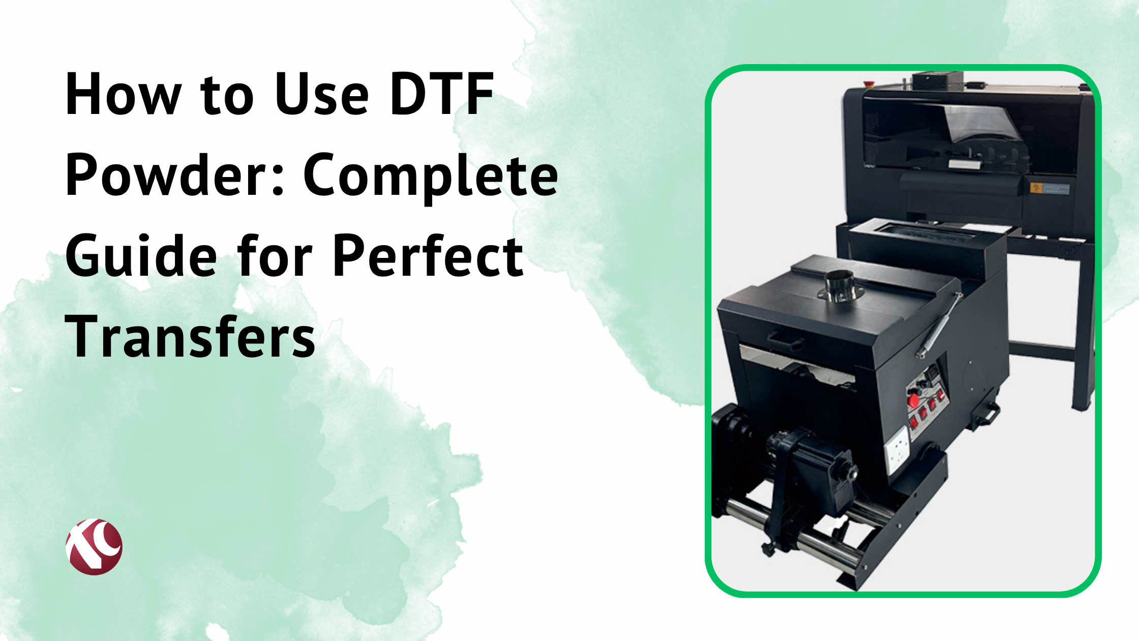
Curing oven (optional): Larger operations use conveyor ovens for curing. More consistent than manual methods. But manual curing with heating elements works fine for smaller volumes.
Xcinkjet.net’s DTF printers handle both garment types. White ink management is solid. Good RIP compatibility.
Ink and Consumables
DTF ink types: CMYK for colors, white for underbase. That’s the standard setup. Some specialty inks exist (neon, etc.) but we’re talking standard here.
Ink compatibility: Use inks designed for DTF. Don’t use random inks. DTF inks are formulated for film adhesion and heat transfer. Wrong inks = bad results.
Hot melt powder: This is your adhesive. White powder is standard. Different particle sizes available—finer powder for detailed work, standard for general use.
PET film: Matte finish works best for most DTF printing. Glossy exists but less common. Quality varies. Cheap film causes problems.
Consumption rates by garment type:
- Light garments: CMYK only or minimal white. Lower ink consumption.
- Dark garments: CMYK plus heavy white. Higher ink consumption. Powder consumption similar.
File Preparation and RIP Settings
This is where many problems start.
Color management light vs dark: Light garment profile = standard CMYK, minimal or no white. Dark garment profile = CMYK plus white underbase generation.
White underbase generation in RIP: Most RIPs auto-generate white based on your design’s colored areas. You control opacity, choke, single vs double pass.
Resolution: 300 DPI minimum in your file. RIP may print at different resolution—720, 1440 DPI output is common. Higher output resolution = smoother gradients and details.
Color profiles: Use your RIP’s recommended profiles. Or calibrate your own. Consistency is what matters.
Testing and calibration: Print test patterns regularly. Verify color accuracy. Adjust as needed. Machines drift over time.
Which Garment Type Should You Choose?
Depends on your situation. There’s no universal answer.
Business Considerations
Target market matters. Who are you selling to? Corporate clients often want white or light polos. Streetwear brands want black. Know your customer.
Pricing strategies: Dark garments cost more to print. Price accordingly. Don’t eat the difference.
Inventory management: Stocking both light and dark blanks is standard. Balance your inventory based on sales data. Don’t let slow movers tie up cash.
Trending colors: Black is always popular. White is always popular. Beyond that, trends shift. Sage green was huge. Then tan. Watch what’s selling.
Profit margins: Light garments cost less to print but might sell at same price = higher margin. Dark garments cost more but also often sell for more. Run your actual numbers.
Application-Specific Recommendations
Different markets lean different directions.
Corporate wear: Light garments dominate. White polos, light blue dress shirts. Professional look.
Fashion and streetwear: Dark garments are huge. Black tees, black hoodies. Edgy aesthetic.
Sports teams: Both. Light for home jerseys, dark for away. Team colors dictate.
Events and promotions: Depends on the event. But light colored giveaway tees are common—they’re cheaper to print.
Children’s clothing: Light garments sell well. Parents like bright, happy designs on white or pastel backgrounds.
Retail products: Variety. Stock both to serve different customer preferences.
Best Fabrics for DTF Printing on Different Colors
Fabric and color interact. You can’t ignore this.
Light Garment Fabric Recommendations
100% cotton: Excellent results. Ink absorbs well. Soft hand feel. White cotton tees are the gold standard.
Cotton blends (60/40, 50/50): Good results. Slightly different feel than pure cotton. Works well with DTF.
Poly-cotton blends: Works. Be aware of potential dye migration on cheaper blanks. Quality blanks are fine.
Performance on each: Cotton gives softest hand feel. Blends offer durability and wrinkle resistance. All work with DTF on light garments.
Dark Garment Fabric Recommendations
100% cotton (black, navy): Best results. Stable. No dye migration issues.
Polyester dark garments: Works but watch for dye migration. Cheap black polyester sometimes has excess dye that migrates during heat pressing, causing color bleeding or discoloration. Test first.
Tri-blends: Usually good. Popular for soft hand feel.
Performance fabrics: Work but test adhesion. Some moisture-wicking finishes interfere with transfer.
Special considerations: Dark polyester needs lower pressing temps or shorter times to prevent dye migration. Or use dye-blocker powder/spray. Know your blanks.
Fabrics to Avoid or Use with Caution
100% polyester (especially light colors): Major dye migration risk. The dye in polyester activates under heat and migrates into your white ink, causing pink or yellow discoloration. Use dye-sublimation blockers or avoid.
Very textured fabrics: Waffle weave, heavy ribbing, pique with deep texture. Transfers don’t adhere well to uneven surfaces. Results are inconsistent.
Water-resistant materials: Treated fabrics with DWR finishes don’t accept transfers well. Adhesion fails.
Nylon: Generally poor adhesion. Some specialty powders work, but standard DTF on nylon is risky.
Special finishes: Fire retardant, anti-microbial, stain-resistant. These finishes can interfere with heat transfer. Test before committing.
Quality Control and Testing
If you’re not testing, you’re guessing.
Pre-Production Testing
Print samples on both light and dark versions. Same design. Different garments. Compare results.
Wash testing protocol: Print sample. Press it. Wash it 5 times. Check for cracking, fading, peeling. If it survives 5 washes, it’ll probably survive 50.
Stretch testing: Stretch the printed area. Does it crack? White underbase on dark garments is the usual failure point.
Color accuracy verification: Compare print to original design. On screen (calibrated monitor) vs. actual print. Close enough? Adjust if needed.
White ink opacity testing: Print a white square on clear film. Press onto black fabric. Is it bright white or grayish? This tells you everything about your white ink.
Common Quality Issues and Fixes
Light garment issues:
- Show-through: Reduce ink load.
- Color bleeding on polyester: Use blocking spray, lower temp, or avoid polyester.
Dark garment issues:
- White ink edges visible: Increase choke setting in RIP.
- Color dullness: Increase white opacity or boost CMYK saturation.
- Cracking: Reduce white ink layers. Verify curing. Check press temperature.
Document what works for your specific setup. Build your own SOPs.
Can you use the same DTF printer for both light and dark garments?
Yes. Absolutely.
Every DTF printer handles both. It’s the same hardware. Same inks. Same film. Same powder.
The difference is software settings. Your RIP software has profiles or modes for light vs dark garments. Light mode = minimal or no white underbase. Dark mode = full white underbase.
Switch profiles. Print. Done.
Xcinkjet.net’s DTF printer models are built for this versatility. Good RIP integration. Easy switching between garment modes.
Do you always need white ink for dark garments?
Basically yes.
If you want colors to show up on dark fabric, you need white underbase. No exceptions. The white creates opacity that lets CMYK colors display properly.
The only scenario where you might skip white: You’re printing pure white designs with no other colors. Then you just print white ink. But that’s rare.
Any design with colors = white underbase required on dark garments.
Which is more profitable: printing on light or dark garments?
Depends on how you run the numbers.
Light garment printing:
- Lower production cost (less ink)
- May have lower retail prices
- Higher margin percentage possible
Dark garment printing:
- Higher production cost (more white ink)
- Often commands higher retail prices
- Margin depends on pricing strategy
Reality: Both can be profitable. Price dark garments higher to account for increased ink costs. Don’t price them the same as light garments.
Market demand also matters. If your customers want black tees, that’s what you sell. Profit exists in both categories if you manage costs properly.
How does DTF compare to other methods for dark vs light garments?
Quick rundown:
DTF vs DTG:
- Light garments: Both work well. DTG is simpler but slower.
- Dark garments: DTF wins. DTG requires pretreatment, often multiple passes, less consistent results.
DTF vs Screen printing:
- Light garments: Screen printing works, but setup costs favor DTF for small runs.
- Dark garments: Screen printing is great for large runs. DTF is better for small runs and complex designs.
DTF vs Heat transfer vinyl (HTV):
- Light garments: HTV works for simple designs. DTF handles complexity better.
- Dark garments: Same. DTF does photographic and detailed work that HTV can’t.
Bottom line: DTF is the most versatile method for both light and dark garments, especially for short runs, complex designs, and variable data printing.
That’s the full picture. Light garments are easier and cheaper. Dark garments are more complex but serve a huge market. DTF handles both better than most alternatives.
Get your white ink dialed in. Learn your RIP software. Test before you run production.
You’ll figure out what works for your specific setup. Everyone’s equipment and workflow is slightly different. But these fundamentals apply across the board.